Thursday, December 9, 2010

Artist Lecture critiques

Polly Apfelbaum: First of all, persoanlly I was interested in her as a person. Compared to other lectures I've attended, she was a breath of fresh air because she had a nice speaking voice and kept the audience entertained with her often blunt comments. I enjoyed seeing her early work (even if I didn't like it personally) because it gave me a reference point to judge her later work. Sometimes at lectures they skim over their early work. I liked the names she would choose for titles like "Language of Flowers" was a piece made from old clown suits. I liked her take on "gallery work" not being so haughty with art speak and the idea of her art adapting to its environment for each gallery show. I thought that her "Eclipse" piece looked "like Klimt threw-up on the floor - beautifully..." as someone remarked after the show. I also enjoyed how she never glued any of her work down so it has such a vulnerable side to it and how she continues to make her work and let the rules follow. When she started showing her more recent phase of work I wasn't as impressed personally as I was with the work from her middle period. Pieces like "Nit in Any Way, Shape, or Form" and "Today I Love Everybody" resembled more of her earlier work with limited and ready made materials with little altering outside of dying of painting. Most of the work she showed from this period consisted of bolts of pre-made fabric being cut up into specific shapes and laid out the length of the gallery space. Some of them were interesting to see the negative and positive spaces the shapes made and possibly what she was thinking when she laid them there. However, I just couldn't let the slightly critical side of me feel that the work from the middle era that had this idea of adapting space along with technical skill sets overpower the though of buying pre-made fabric and doing little altercations. The middle phase of her work seemed more lively and expressive to me personally by it being pushed to such a degree that no one but Apfelbaum could call it hers. Maybe she'll circle back around to these processes again because I felt that they along with "Funky Town" are some of her strongest work.

Shawn Sheeny:
I was really excited about seeing this lecture because I really enjoy the art of pop books. I would say that this lecture was somewhat lukewarm as far as lectures go not because Sheeney's work wasn't interesting or that he wasn't pleasant to listen but that he decided to give a slow-paced history lesson and didn't show as much of his work as I thought he would. I did learn a lot about pop-up books and was surprised that it took almost 10 years to make just one by himself. I also enjoyed some of the other artists he mentioned such as Matthew Reinhart. I got the impression that he would be an even better speaker with smaller crowds where he'd be allowed more freedom and time to explain more of his own personal processes as opposed to teaching about the medium as a whole.

Final Portfolio 12/9

Today our portfolios are due. One of the problems (beside desiring more time to edit my projects further) would be that my DVD has a slight viewing problem. The DVD is fine until you press one of the buttons to activate the video. Suddenly the video will stretch the menu picture right before it plays the file and continues when the video ends and returns to the DVD menu. Someone suggested to me that there is something wrong with the aspect ratio default in DVD Studio Pro and the image sizes of my video files. It is weird because it never showed up when I'd simulate it and even when I later played it on a separate DVD player it sometimes wouldn't occur at all.

Tuesday, December 7, 2010

12/7

Today our Finals are due. Mine is technically finished but as always it could be refined further. There are a few hiccups in the walk-cycles and there are some moments that could be slowed down. These problems are all minor things and really the middle scene that I added in of Star girl jumping to catch the orb is what I'm concerned with and if it makes sense for critique. My DVD isn't where it needs to be completion-wise and I'll make it tonight for critique on Thursday.

Thursday, December 2, 2010

12/2 checkpoint

I had a multitude of problems to meet this checkpoint which I honestly didn't. I noticed that my ground layer that moves, controls, and parents everything else in my timeline had this weird ghost transparent layer on it so I decided to get rid of it. I saved and went into Photoshop but after I finished and reloaded the footage in After Effects it looked like my ground layer along with everything attached to it disappeared. I discovered that it had not vanished but simply moved far to the right of the viewer screen. This caused many problems since it also skewed all the mathematics of my edited layers and assets. Nothing was synching up right. I tried to just quit out and open it back up since After Effects was having other problems due to the lagging of the server. My file didn't change when I opened it back up because it still registered the now messed up PSD file as the parent. I then had to just un-parent all 100 layers and try to register all the keyframes on the timeline and then match everything appearing and disappearing again along with the character's walk-cycles. Its still a little jerky in spots and I didn't really get around to editing past what I already had. I however did allow myself spaces where even though there's nothing right now it'll be filled with more buildings and another scene in the middle. I'll really have to haul it this weekend to get all of this ready for the DVD files due Tuesday 7th. I didn't get a chance (regrettably again) to make tags and text for the DVD. I'll obviously have to plan the DVD this weekend.

Tuesday, November 30, 2010

11/30 Checkpoint

I managed to have a really rough edit for class today of the entire animation. It could be timed out slower and the characters could have more personality in their keyframes because at times you would just see the keyframes acting and not a character. There needs to be some more pausing with her character at the beginning and in the 4th scene between the city and the forest. The lens flare at the end just looks like an awful lens flare and needs to be tweaked. The moment of the floating orb looks stilted and moves abruptly instead of gliding-like.

Besides these problems I didn't do my text tags for my DVD portfolio that I wanted done for today. This means that again I didn't quite meet my deadline and that by Thursday Dec. 2nd I need to have edited the final project along with creating all of my text/synopsis/tags for my DVD portfolio.

Tuesday, November 23, 2010

11/23 Tuesday Scene 1 and 2 rough edit

http://www.youtube.com/watch?v=al9Y05TS580

11/23 Tuesday

I realize at this point that I am behind. Out of the five scenes I need to make I only have two so far. What has been taking me so long to make is the walk and run cycles and organizing the main composition in a way that I can nest other comps and slide all of my pieces horizontally across the screen. I know that my deadline for today was to have a rough version of the entire piece. I realize that I have to now double up over break to get back on schedule. So for next Tuesday the 30th of November I'll have to have my full rough edit along with the first 4 rendered projects and all of the text for my DVD. I see this as do-able because know that I've tackled all of the set up issues of run cycles and building my composition, the next three scenes won't provide as many problems and I have pervious comps I can nest to make the process faster. Also I can do the text summaries and biography at home in a text document.

Thursday, November 18, 2010

11/18 Checkpoint

I realize that I did not meet my checkpoint goal today of animating to part 7 in my storyboard and only made it to part 5. Also the part I animated as always can be improved and is not the final version of that part (which is why I left my calendar open so I can edit and tweak). I did get her running composition made which since it will be used frequently will help with repeating actions as there is a lot of running involved. Looking at the seconds I have so far again I would like to add some more subtle development of her character at the beginning suchas her studying more of the environment before she starts running. She could look around more and plausibly walk around in the first scene to get a feel of the buildings. With all of this in consideration along with whatever is said in critique I still am aiming for the same goals in my calendar despite being a scene behind. I will just have to work that much harder but I feel that having some of the initial keyframing and setting up along with further undersading how I'm going to build the rest of my parts has helped the process movealong faster. I don't feel that it will set me back greatly. Also I edited my Moon Boy; mostly his skin:

Tuesday, November 16, 2010

Character desgins


After looking and critiquing I've decided that my boy character needs some revisions. His colors don't have to be all blue and it makes him look like some sort of weird phantom that is foreign to her warm tones (in a bad way). He needs to look like he has some flesh tones in the skin. He will still have gray/blue hair but he needs to look more human and less ghost/alien and it doesn't have to be pushed so hard that he is this blue Moon Boy; he can just happen to have some blue tones like she has some red ones. Also they look like a weird brother and sister relationship. I think I made them exist, outline-wisre, in way too much harmony. I really just need to change the shape of his head and the mouth a little (possibly even the eyes a little thinner or more squared).

November 16th

I created the rest of my Photoshop assets for today. The biggest problem I had was with Moon Boy and not trying to make him look like a something from Avatar or the Smurfs since he is blueish in tone. I think maybe I should try to make another version where he has a blue outline and silver colored clothes. I think by having so much concentrated blue he just looks like some weird alien character and not what I intend. Also I made a couple of different tree pieces where I'd just copy and paste them but I think I made need to make more and make them more varied so they won't just look excessively repeated. I decided to take out the curtains since it was mentioned in class that they weren't needed. Also I plan to drop the stage lower in the view so it won't hog up as much space.

Calendar

Nov. -Tues 16th (have all assets done)
-Thurs 18th (get to scene 7 in storyboard)
-Tues 23rd (get to part 14 in storyboard)
Tues 30th (have all initial animating done for critique)

*Dec. - Thurs 2nd (Work on editing first half of projects for DVD portfolio)
Tues 7th (edit last half of projects for DVD portfolio)
Thurs 9th (turn in DVD portfolio)

*for class continue to also improve this Final project.

Thursday, November 11, 2010

Final Project Aesthetics Scene

For this assignment we just need to have our enough assets made to create a scene to test how the overall aesthetics will look for our final. This doesn't mean that this didn't require some work and thought. I decided to change my Star Girl's outline from black to a reddish-brown because the heavy weight didn't mix well with the backgrounds and scenery I made for my other pieces. The biggest problem I think I have right now is trying to figure out how to make the CC Particle Effect not look like a glow effect.

I think I need to add more layered textures to the trees and add more trees to make it look haunting and like a forest. I think I need to add more buildings in the background layer to emphasize the fading away of the city. Also the more I look at it, the "stars" in the sky are too small and need to be slightly bigger but not so much as they distract the viewer or crowd the scene. I think I need to have a further distance from the city and the tree line. Also I wonder if there should be some sort of fog effect around the trees. And furthermore if they should have some sort of line weight to them. The yellow tree could be pushed back further into space to show depth and the color hue could be toned down because the yellow is pretty distracting.

Inspired by:
This is a shot from a animation that Erik Nakamura and Saelee Oh. Saelee Oh does a lot of cut paper work and I just was drawn to this piece because even though the individual assets are flat the shadows and layering add a lot of depth.

Monday, November 8, 2010

Changes/additions to storyboard

So I added some more scenes to my storyboard to better explain the action and help me visually with the space I'm trying to design. I added in a kiss at the end like what was suggested in class and I also changed the scene around #7 because having them switch paths is confusing for this linear space. I also wanted to show that I'm comparing the idea of space and perspective purposefully to the unreality of Medieval paintings and their distortions. Hopefully this will shed some light on what I seemed to have not communicated Thursday about how there is a foreground and background and how they relate to each other. Also here's my 3 Act Structure Diagram:

Thursday, November 4, 2010

Final Project Pitch

My final project will be a narrative. I looked to my theme of finding and balancing a child's perspective with an adult mind to draft my story. I found that I still like these ideas of going on a journey in search of truth, hope and the extraordinary.

Pitch: A girl discovers a mysterious glowing aura and decides to follow it through a city and into a forest. Along the way she notices that a boy is also following the force to find at the end of their journey that they have this understanding of truth in common. It all takes place on a stage with the girl and boy appearing as puppets.

Visuals: Aesthetically I want the piece to feel like a stage and the char
acters to look and behave like puppets. They will have shadow effects applied to their bodies to make them appear as 3-D objects as will rest of the sets. The stage pieces will be revealed in layers and they will always appear from below or slide "off" the stage as the sets change.


I want the characters to finally look like this piece with its 3-D qualities and textures.
Also the character himself behaves and looks very much like a puppet.


I want the color palette to try to resemble this in a way, meaning I found the use of lighting, shadows and color interesting. I also would like to incorporate the layers on the ground; not necessarily the stitching but layering up the ground sets to make them look like cutout collage.


This is an illustration of a city by Lane Smith and I really enjoy the abstract representation of the buildings with outlining them in blacks and whites and filling them in with texture blocks. I was wanting to utilize a series of purple hues while the ground would be reds. The image above the Lane Smith one is a background form the animated show Samurai Jack which had stunning visuals. I want the trees to resemble that odd twig form with spindly branches popping out.


I enjoy the real light show this piece puts on. I don't intend my "glow" and particles to take up as much space as this video has and in reality it'll only be a single orb with trailing sparkles waving across the screen but the animator's use of blurring and dispersing is something to think on and draw from.

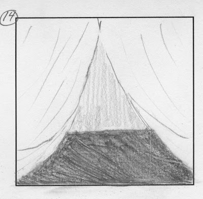
Summary: The piece opens with a curtain folding back to reveal a stage with a backlight starry night. A city pops up from below the stage in layer pieces. One of the buildings has a small door on it that opens as the main Rainbow girl walks onto the set. She looks at the buildings off to her left as a mysterious glowing orb flows in from the right. She turns her head and notices it only to watch it move off screen on the right. She proceeds to follow it as the entire "set" moves to the left to reveal the next scene. As Rainbow girl follows the orb she sees that a Blue boy in the background of the set also noticing the the orb and following it. As the set moves to the left again, both the girl and boy are following the light but with her in the background and him in the foreground. The next scene shows the city trailing off and into a forest. The girl runs to the middle and stops realizing that she lost track of the light. It suddenly comes from the left and continues into the forest with her following again. The next scene shows the light hovering in a clearing in the forest. As she runs up tot he light the foreground trees scale back to reveal that the boy is across the clearing also having found the light. They both slowly walk towards the light transfixed and then notice each other. The light then glows brighter engulfing the stage set. Finally it dies away and the set goes with it. The curtains close on the stage.

Final Project Storyboard Pitch

As always this is subject to change:


-the city parts (background) rise up from behind the stage scene.
-more of the buildings rise up from the background and you notice one of the foreground houses has a door.

-the door opens to reveal the main character, Star Girl.

-A particle glow comes in from the left and flows to the right off-screen, as she notices and follows. -she exits the frame.

-the next scene (as the background layers slide down) reveals the Moon Boy who is preoccupied with watching the orb.


-Star Girl enters the frame and notices the orb and the boy.
-The orb moves off-screen and both of them start to follow it while remaining on separate grounds (i.e.) Foreground and background)


_She finally leaves the frame.
-The next scene slides into view and the particle is still ahead of them; she enters into theframe first.

_He finally enters the frame.

-The shot ends with him leaving the frame as they all race right.
-The scene slides left to show that the houses are coming to an end and a forest is beginning. The orb isn't suppose to be in this shot.

-She comes to a halt and ponders her surroundings and tries to find the orb again.
-The orb enter from the left again to travel to the right into the forest. She watches and then after contemplating follows it.
-The scene shifts to the left and then once the orb is revealed in the middle the trees in the foreground move off to the sides to open up the scene.

-They both walk foreword and see each other.

They both come forward and kiss.


Tuesday, November 2, 2010

Final Project Ideas

1. I still want to see if I can try to make a project about a girl with rainbow stars for feet who is looking for a blue moon boy. I love the idea and I think aesthetically it would be interesting to be set like a play unfolding. I would want them to look like puppets with hinges or strings of some sort moving along this moving set piece. I would want a city to literally grow up and move around her. She would see the boy in the distance but loose track of him. At first she notices some sort of particle /fairy dust floating in the "city" that glows like she does, which she follows and sees a blue boy who also glows. She sees him follow the fairy dust further but he doesn't look back to see her. She follows the glow dust to a clearing where the boy is standing and they both notice that they glow together. I know it sounds like a lame story about a girl just chasing after some guy but I'd want it to be told from her side but imply that while she was searching, he was as well and that it lead them to each other. I envision many particle and glow effects along with character pegging and using layered compositions to move the scenery. Also I'd want to employ many drop shadows and the use of limited 3-D space to allow for the viewer to "see" how the set was "made".

2. I would want to continue with my trailer trash Disney princesses. I would like to try to make a single video focusing on just Snow White or try to tell a story about Snow moving in with Cinderella and the possible shenanigans they get into. With this idea I could also try to come up with other story-lines like a hoarding Little Mermaid, an alcoholic Bell, or drugged out Alice. Those ideas are obviously a little more cliche and need some more thought but still possibilities that could use further development. I could always tell the story from just Snow White like I had in my original story back in project 5 but just cut out all of the scenes with Cinderella and Sleeping Beauty and use the same ideas.

3. I was thinking about continuing the little creepy video game doll I made at the beginning but now with a greater understanding of compositions, pegging, effects etc. I could continue to make the whole level or add more story content to feel like a hybrid of video game symbols but more story driven. I realize now that I was just trying to do too much with little knowledge and that it should look less like watching a video game as opposed to being emerged in one. I would try to tell the whole "level" with some sort of final confrontation/ boss at the end. I think I would keep a similar style but obviously expand upon it and make it more detailed and creepier with effects and more layered backgrounds. I foresee making some backgrounds with preset animating in them and then blurring them out and bringing them in as compositions to make them look off in the distance with a clear background and foreground.

Youtube link for Effects

http://www.youtube.com/watch?v=Wuhtj96ThpY

Effects Fiasco

A. Part 1 Particle Explosion

Tutorial used : http://www.videocopilot.net/tutorial/particle_explosion/

Background: added a solid layer with a Ramp effect to basically include a gradient on the background.

Text: Scaled up the words and then used a Forced Motion Blur on them to make them shatter.

Particle1: the first particle generator was created using the Particle World and a eventual Lens Blur and Curves effect. I linked up (an expression) the Birth Rate (Particle World) to the position I use later in the Control slider layer. I also linked up (used an expression) the X,Y, and Z positions to the corresponding X,Y, and Z positions of the later CCNull layer. ( I have technically 5 particle layers that all use the Particle World effect of various sizes and colors; the ones named Sprites however are linked to using a glow.png as the image instead of the particles found in After Effects for brighter "glows" and automatically larger spheres).

Control Slider: I used the Slider effect and adjusted keyframes along the timeline that have the Particle World(s) linked to them to create the bursting and dying of the particles.

CCNull: This layer actually has nothing on it but I had to copy the expression information from my other composition (3DRoom) in order to use an expression to attach the X,Y, & Z in the Particle(s) to something; in this case a blank null object.


Part 2 3-D Room with Strobe Light (this actually had to be made before finishing the Particle Explosion because it relies on the 3-D information found in the expressions on the layers in this composition).


Background(s): I had to take a Black/White jpeg and utilizing the Unified Camera Tool and Rotation Tool to position and copy them into 3-D space to create a room. To extend the room I added a Motion Tile and changed the Output Width to 500 to make the hallway extend. I also set up an exposure on the back wall to tone down how "hot" and bright it was.

Camera: I moved the camera along the Z space and pickwicked the Position to move back in space.

Light: I added a light source in the middle of the room and added the Wiggler to allow for it to flicker while in motion.

Text: I moved the text up and allowed for it to appear by changing the opacity levels. I pickwicked it and added Wiggler expressions to allow the words to hesitate and "float" back after the camera stops zooming in.

Particles (strobe): I used another Particle World and the Glow effect. I attached the strobe light to a null object in order to move it around in Z space successfully. I then added to the Wiggler effect to allow to dip and dive.


The tutorials (vidoecopilot.com) themselves were okay as far as videos go when Andrew Kramer finally got around to talking about After Effects instead of telling lame jokes. He's either really cocky or really lonely but he did have a nice speaking voice and the audio was sharp and clear the whole time. Sometimes it would throw me for a loop when he used something in the older versions and I couldn't find it in the current one, but it's to be expected with older tutorials. His (company sponsored) videos were no where near as bad as when I tried to watch this user created video off of creativecow.com. I know that all the videos on that site aren't like this one I saw but since its open for user content sometimes really old a poor quality videos stay on there. This one that I looked up was about making 3-D text but it was sooo old like, windows '98 old. It looked like it was made in the first After Effects. Whoever the guy was had a horribly dry voice that didn't help when combined with poor audio quality. His "solution" to making text appear "3-D" was to simply copy and paste the text about twenty times and displace each layer to make it look 3-D. So after having view that and a horrible one on Youtube that didn't even bother to full screen the video (so you were forced to just follow their mouse the whole time) I found Andrew's little annoying comments not to be so bothersome. He actually moved slow enough to where you could have it playing and work at the same time in some moments. He would occasionally playback his progress so you could compare your's to his to make sure you doing it correctly. Another detail that I which was addressed in Andrew's was the fact that half way through the video I realized that I couldn't make the particle effect by just watching one video but was forced to build the 3-D room. That would have been a helpful notice under the video. Also he used a plug-in blur effect that made some of his particles look and move differently but there was no description like in others of plug-ins. Granted it wasn't completely necessary like other tutorials to make the video but it still would have also been nice to say beforehand that without it your video will look slightly different.


Thursday, October 28, 2010

Project 7 version 2

So I re-edited my typography project because honestly it looked desperate and sad. I tried to differentiate the "voices" a little more by adding color to hope and making less awkward transitions. I got rid of the hideous hand-pegged distortion on the word "REALITY" because it was just dreadful. I also tried to add a little more "bantering" between the hope and reality to show them fighting for space and/or control. I know this would be much better if I had more words which I could possibly add at a later date. For right now I just tried improving by getting rid of the terrible distortion, adding color, and improving the interaction between them where they had none previously.

Tuesday, October 26, 2010

Project 7 type assignment link

http://www.youtube.com/watch?v=kCCZHC6K0f4

Type Project 7

So I've come to find that all the features of text in After Effects is almost overwhelming in how vast and complicated some of them are. I noticed it was much easier to play around until you found a happy accident then it was to come up with an idea and try to execute it using the little knowledge I have on how text works in After Effects. My biggest problem was that even though I knew what I wanted to do I have no idea how to use the effects to make said ideas. I would just feel lost and overwhelmed. I couldn't really think of how to look for web tutorials considering I didn't know what I was looking for would be called. Things got really annoying when I came into the problem of simply not being able to type on a mask path. For some reason when I set up a text layer and set it to a mask path it would be off set from the path as its clearly trying to follow the direction but isn't set properly. I tried changing anchor points and group anchor points, changing the grouping from "word" to "character", and countlessly reseting the first margin. It just wouldn't work so I decided to use the obsolete path type effect, which doesn't allow for as much control but in this case gets the job done. Many times throughout this project I had to just abandon using text tricks and resort to messing with basic position and scale tools. I'm sure that there is some way to do what I did by hand with the tools by using the text effects but I haven't found it yet. The unfortunate problem with this assignment is is that mine looks completely unfinished (and is) and doesn't make much since because I only did the words hope, real. and reality. I basically only made about a third of my whole project. I completely underestimated how difficult using text would be on this project.

Thursday, October 21, 2010

The Do and the Line Chuck Jones clip

http://www.youtube.com/watch?v=9ngeJQCv0VQ

Typography Project outline


I've decided to do a kinetic typography piece for this assignment. Since I'm still dealing with the dynamic of a child versus adult perspective I decided to use a selection of ten words for both voices as a sort of mini conversation. The words are as follows:
Child- tiny, play, create, fuzzy, smell, huge, sleep, always, real, hope
Adult- trivial, panic, conflict, flustering, sickening, hollow, schedule, ag
gression, reality, hope

I want it to have the words appear after one another as if they are having a visual conversation. The child would say the first word (and the motion of the word would be uplifting and happy but visually describing the action) and the first letter would only remain to spell out (and act out) the adult's response. I want the words as they get to start to
move faster with the Adult's words really taking up almost the entire screen and kind of towering over the Child's words until the word "hope" appears and the Adult's word "reality" backs off and then the Adult's hope font overtakes the Child's. I know the words don't exactly flow like a real con
versation would but I was wanting it to be things that children encounter or experience and what the assumed "adult" behavior toward that actin would be. I
drew some inspiration from these videos:
http://vimeo.com/6382511 this one was just beautiful for its many "fonts"
http://vimeo.com/3600380 this is the one I looked at closer for more of what I intend to do on this project, obviously not as long but I do enjoy how the actions follow the words


This (in the older post right below) is from the old Chuck Jones cartoon the Dot and the Line. I felt inspired by this despite its lack of text because it still uses symbols that have such expressive characters without faces.

Tuesday, October 5, 2010

Midterm Assets

We needed all of our assets for today, as in everything that is required to actually make our midterm projects. The only thing I'm really worried about besides being told to push things farther, is that once I start making it there will be characters or scenes made for the project. These special scenes would be ones that I need for only one instance but I guess I won't figure it out into I actually get into making it. Again I'm concerned that people will tell me I just need to push things farther like adding more nasty details to her home and to the rats. The nice thing is is all I have to do is work on the PSD file and reload the footage.

Thursday, September 30, 2010

Revised Story (Cinderella)

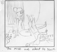
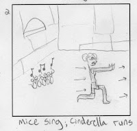
As pointed out in class Tuesday, I realized that it would be better to just focus on one character. I decided that Cinderella would be the best since her relationship with the mice is the focus of the original. In this one she still lives in a trailer and she's still a slob but she lives alone. The scene opens with her looking through her closet. As she looks around her room in confusion she notices a mouse with the hat she's been looking for. The both scare each other and the mouse runs away into the kitchen. Cinderella follows it because she doesn't want it to get away without exterminating it. She runs into her nasty, mold infested kitchen to discover that her old mice friends are everywhere. The scenes switch to rendered disgusting views as what Cinderella sees. Even though they look disgusting they are actually trying to help her by cleaning her dishes and trash for her. She chooses to overlook this and reach into the cupboard for the rat poison. She mice notice this and come up to her bearing her glass slippers. She changes her mind as she realizes what they're trying to restore with her. Again the view black mask- focuses on one mouse in the bottom left corner and scales out again to reveal the tea party. Only Cinderella and the mice are at this party. Again a mouse tries to offer her sugar but all she sees is a nasty rodent but tries to ignore it and uncomfortably accept the sugar anyway. It ends on the silhouette of the tea party.
I want this video to really focus on her relationship with her past and her past friends. I want to illustrate how when people get older and reality sets in that they tend to treat their childhood friends differently; they see it for not perfect but for the flaws that they failed to notice. But in order to deal with one's past and see the joys of childhood mixed with the maturity of adulthood you have to put the flaws aside to enjoy a person/situation for what they (it) are/is.

Revised storyboard (Cinderella)